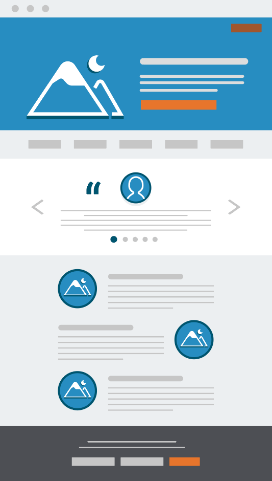
In the competitive world of B2B marketing, turning website visitors into customers requires a targeted approach. Enter the B2B landing page, a web page specifically designed to capture the interest of businesses, not individual consumers. Unlike your company’s main website, B2B landing pages are laser-focused on a single offer or campaign. They present clear, concise information about your product or service’s value to other businesses. Moreover, it includes a compelling call to action to convert visitors into customers. Think of a B2B landing page as your digital handshake with potential customers. You can have a chance to make a solid first impression and convince them to shop for your brand.
What is a B2B Landing Page?

B2B landing is a web page designed for businesses visiting your website and initiating sales. For instance, visitors filling out a contact form, this information will help generate more leads. In B2B marketing, where every interaction counts, B2B landing pages are crucial in converting website visitors into potential customers. These are specially designed web pages distinct from your company’s main website.
B2B Landing Page Example
There are many examples of the best B2B landing pages showcasing their services and initiating sales. Some examples of B2B landing pages are discussed below. Read this article to learn about the best B2B landing page examples.
1. Bonjoro
Bonjoro is not directly related to creating the best B2B landing pages; it can be vital to your post-landing page strategy. It is a service that allows you to send personalized video messages to website visitors who convert on your B2B landing pages, like signing up for a free trial. These customized touches can increase engagement and conversion rates by thanking visitors for their interest and highlighting your value. Imagine a short video welcoming a new lead by name and showcasing how your product solves their business needs. That’s the power of Bonjoro in the B2B world.
2. Booxi
Booxi is a software designed for retailers to streamline appointment scheduling through a minimalist landing page. It welcomes its audience with interactive, impressive, eye-catching animation. This approach allows customers to effortlessly book in-person consultations or services directly from a brand’s website. It is a powerful mobile landing page that works as a powerful engagement tool, making visitors more likely to explore. It helps retailers simplify the booking process, potentially leading to increased customer satisfaction and improved brand image. Lastly Booxi keeps things clear and convenient with a minimalist landing page, ensuring a smooth customer experience.
3. Descript
Descript is a web-based audio and video editing platform with a user-friendly interface. It allows creators to edit projects using individual words or sections of audio and video, offering a more flexible approach than traditional editing software. Descript also provides automatic transcription and AI-powered tools for editing audio, like removing unwanted sounds or changing a speaker’s voice. It offers these features in a cloud-based platform, making professional-quality editing accessible from any device.
4. Gusto
Do you need help navigating the difficulties of payroll and HR for your small business? Gusto’s landing page might be your answer. It’s a digital entryway showcasing how their platform can simplify your life. Gusto takes care of everything from employee paychecks and taxes to managing benefits – all in one place. It likely uses visuals and clear language to show how its user-friendly system replaces manual work and paperwork. It highlights many benefits of their service, like saving time and reducing stress. Gusto’s landing page aims to convince you to explore how they can streamline your HR and payroll needs.
5. Lemlist
Lemlist’s landing page focuses on streamlining your email outreach efforts. Imagine a website that promises to eliminate the hassle of cold email campaigns. Lemlist’s platform might offer features like email personalization, scheduling, and tracking all in one place. Their landing page could showcase success stories. Moreover, it also highlights their user-friendly interface, which helps craft effective outreach campaigns. It emphasizes increased engagement and improved response rates. The Lemlist landing page aims to convince you to try their service and transform your email outreach strategy.
Social Media Landing Page
Social media landing page is a specific web page designed for people who click on links shared on various social media platforms. It differs from your main website; these social media reference landing pages focus on a single goal. For instance, you are getting someone to sign up for your email list or buy a particular product advertised on social media.
Landing Pages For Instagram
Instagram landing pages need to be mobile-first champions. They should seamlessly mirror your ad’s branding and value proposition and instantly explain the benefit of clicking. Testimonials and visuals like images or videos build trust and grab attention. Speed is key a fast-loading page ensures visitors see your offer. Here is an example of an Instagram landing page template that will help you design or recreate it.
Restaurant Landing Pages
A restaurant landing page is a specific web page designed to target people who find you online, often through ads or social media. These landing pages have one clear goal: to get someone to take a specific action.
This action could be:
- Making a reservation
- Placing an online order
- Signing up for a mailing list for promotions
These b2b landing pages are built to be super focused, highlighting the restaurant’s most enticing features and making the desired action easy.
Related Post: What Are The Basic Web Design Principles? Explained
How To Optimize B2B Landing Pages?
Optimizing B2B landing pages is about turning website visitors into business leads. Focus on clear communication and a value proposition. Craft a compelling headline that speaks to your target audience’s pain points. Explain how your product or service solves their problems with concise bullet points. Make sure a clear call to action (CTA) button stands out. If you use these strategies, you will optimize landing pages.
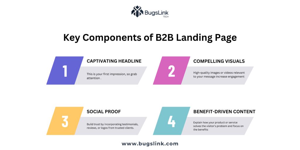
What Are the Key Components Of a B2B Landing Page?

The critical components of the B2B landing page are designed to capture attention and drive a specific action. Some of the critical elements are the following.
- Captivating Headline:
This is your first impression, so grab attention with a clear, concise statement highlighting your value.
- Compelling Visuals:
High-quality images or videos relevant to your message increase engagement and make the page more visually appealing.
- Benefit-Driven Content:
Explain how your product or service solves the visitor’s problem and focus on the benefits they’ll receive.
- Clear Call to Action (CTA):
Tell visitors exactly what you want them to do next, whether signing up or purchasing. Use strong verbs and a prominent button.
- Social Proof:
Build trust by incorporating testimonials, reviews, or logos from trusted clients.
The Bottom Line
In today’s digital marketing landscape, B2B landing pages are essential for lead generation. These targeted landing pages capture the attention of potential business customers and convince them to take a specific action. A streamlined sales pitch that highlights the value you bring to their business challenges. You turn website visitors into qualified leads by crafting a compelling B2B landing page with a clear call to action. So, take into account the power of a well-designed B2B landing page. It can be the bridge between brand awareness and building valuable business relationships.

