
If you’re stepping into the world of design, whether you’re a student, developer, marketer, or aspiring UX professional,you’ve probably encountered a flood of design jargon. Although terms like “Wireframes,” “Affordance,” and “User flows” are frequently used, a thorough understanding of them is essential to producing incredible digital experiences.
This blog provides a clear and interesting explanation of more than fifty key UI/UX terms. Simple explanations that will help you sound like an expert and think like a designer, no jargon or dull textbook definitions.
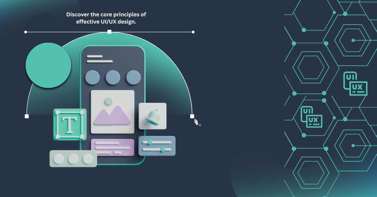
Now let’s get started!
UI/UX
Understanding the distinction between UI/UX is crucial before delving into the terms, as they are frequently confused:
- UI (User Interface) is all about the Visual elements you see and interact with on a screen, buttons, menus, color, icons and typography.Consider it a product’s “look and feel.”
- UX (User Experience) focuses on how a user feels when using the product. It covers usability, satisfaction, ease, and the complete journey, from first impression to final interaction.
While UI is the surface, UX is the underlying experience that makes or breaks a product’s success.

Core Concepts
1. User Experience (UX)
How a consumer experiences a product. Consider a shopping app where checking out only requires a few taps. Good user experience is seamless, easy to use, and free of frustration.
2. User Interface (UI)
A product’s visual design includes its layout, buttons, font, colors, and icons that users can see and interact with.
3. Wireframe
A simple, low-detail sketch or blueprint of a page layout. It indicates where things go without color or images, kind of like an architectural plan for a building.
4. Prototype
Users can click or tap through an interactive simulation of a design during Prototyping. It facilitates testing functionality and user flows before actual development.
5. Mockup
A detailed, static visual design that depicts the exact appearance of the finished product. Mockups lack interactive features, in contrast to prototypes.
6. User Flow
A detailed flowchart that illustrates the steps a user takes to finish a task, such as making a flight reservation or signing up to a newsletter.
7. Information Architecture (IA)
The arrangement and labeling of content on a website or application. Similar to a well-organized library, good IA allows users to find what they need quickly.
Understanding Users
8. Persona
A thorough fictional profile based on actual data that depicts a typical user. As an illustration, consider “Amna,” a 28-year-old graphic designer who favors simple apps.
9. Empathy Map
A visual help that records users’ thoughts, emotions, words, and actions. It gives design teams a deeper understanding of user motivations.
10. User Journey Map
A timeline that documents a user’s feelings, experiences, and problems during their engagement with a good or service.
11. User Research
The method of learning about user needs and behavior through surveys, interviews, or in-person user observation.
Testing and Validation
12. Usability Testing
Watching actual users’ interactions with your product to determine what functions well and where they run into problems or become confused.
13. Heuristic Evaluation
Professionals evaluate a product based on accepted Usability Principles, like error prevention and consistency.
14. A/B Testing
Running experiments comparing two versions of a design (Version A vs. Version B) to find out which works better.
15. Accessibility (a11y)
Designing digital products that are accessible to all users, including those with disabilities. This calls for keyboard navigation, good contrast, and code that is compatible with screen readers.
Design Techniques & Practices
16. Responsive Design
Designing layouts that adapt to various screen sizes, from large desktops to tiny phones, automatically.
17. Mobile-First Design
Ensuring a seamless experience across all platforms by designing for mobile devices first, then scaling up to tablets and desktops.
18. Design System
A collection of rules, style manuals, and reusable parts that maintain a product’s consistency and facilitate future design.
19. Grid System
A layout framework made of rows and columns to align and manage content neatly and predictably.
Visual Language
20. Typography
The art of organizing text, choosing fonts, line heights, sizes, and spacing to improve readability and tone.
21. Color Theory
Understanding how colors interact, the emotions they evoke, and how to use them productively in design.
22. White Space
The empty space around elements helps reduce clutter, increased focus, and make content easier to digest.
23. Visual Hierarchy
Organizing components according to size, color, and positioning to help users focus on the most important aspects.
24. Consistency
Maintaining consistent design patterns to give users a sense of familiarity and predictability.
Psychology in UX
25. Cognitive Load
The mental effort users expend when using your product. Lower cognitive load means easier and more pleasurable use.
26. Hick’s Law
Users take longer to make a decision when you give them more options. To make decisions more quickly, simplify your options.
27. Fitts’ Law
A target’s size and distance determine how long it takes to reach it. It’s quicker and simpler to tap larger and closer buttons.
28. Gestalt Principles
Psychological principles that describe how people naturally group visual elements such as closure, similarity, and proximity.
29. Affordance
Design cues that suggest how something works, like a button that appears or a slider that invites dragging.
States & Interactions
30. Microinteractions
Small animations or feedback, like a loading spinner or a “like” button animation, that make interfaces feel alive.
31. Component
Reusable design building blocks, like buttons, cards and input fields, that speed up design and maintain consistency.
32. Call to Action (CTA)
A prompt motivating users to take an action, such as “Subscribe,” “Buy Now,” or “Learn More.”
33. State
Different terms of UI elements, like normal, hovered, clicked (active), or disabled.
Metrics and Performance
34. Conversion Rate
The percentage of users completing a Preferred action, such as making a purchase or signing up for a newsletter.
35. Bounce Rate
The percentage of visitors who leave a website after only looking at one page. A high bounce rate may indicate issues.
36. Heatmap
A visual that helps with attention and behavior by displaying the areas where users click, scroll, or hover the most.
37. Analytics
Data collected on user behavior, traffic, and engagement to calculate the success of your UX.
Collaboration & Process
38. Front-End
The part of a website or app users see and interact with, built with CSS, HTML, and JavaScript.
39. Back-End
Server-side logic and databases that power the application behind the scenes.
40. API (Application Programming Interface)
A bridge that connects various software systems, such as the front-end and back-end.
41. HTML/CSS
Basic web languages in which CSS provides visual styling and HTML organizes content.
Product Development
42. Agile
A flexible development methodology that prioritizes frequent releases, user input, and ongoing enhancement.
43. Scrum
An Agile framework in which teams meet daily to stay on course and work in brief “sprints .”
44. Sprint
A set amount of time, typically one to four weeks, during which a team finishes particular features or tasks.
45. Minimum Viable Product (MVP)
The most basic version of a product that offers value and can be tested with users at an early stage.
46. Stakeholder
Anybody with an interest in the product, including investors, managers, users, and clients.
Watch Outs and Must-Knows
47. Dark Patterns
Deceptive design techniques, such as concealing “Cancel” buttons, that coerce users into taking actions they may not want. Stay away from these at all costs..
48. Delight
Users are surprised and pleased by small, considerate details, such as humorous copy or entertaining animations.
49. Scalability
Small, thoughtful touches like humorous copy or engaging animations surprise and delight users.
50. User-Centered Design (UCD)
Designing with the user at the heart of every decision, ensuring their needs and feedback shape the product.
Conclusion
There you have it, more than fifty essential UI/UX terms to help you confidently navigate the world of design. These words will improve your knowledge and skill set, whether you’re working with designers, getting ready for an interview, or simply interested in the internal workings of your favorite apps.
Remember that UI/UX is about making things function well, feel intuitive, and make real people’s lives easier, not just about making them look nice.
Keep learning, bookmark this blog, and share it to your team. Because your best tools in the rapidly evolving field of design are knowledge and curiosity.
Visit our website, BugsLink TECH, for more insightful blogs on UI/UX design and innovation.
FAQs
What’s the difference between UI and UX?
UI is how a product looks; UX is how it works and feels.
Why learn UI/UX terms?
To improve communication, design smarter, and create better user experiences.
Do I need coding skills?
No. UI/UX focuses on design and user behavior, not just code.
How can I apply these terms?
Study real apps, sketch wireframes, and try design tools like Figma.